Ledge & Co.
A clear, trustworthy website for a modern accountancy firm serving growing businesses.
The project at a glance.
A clear, trustworthy website for a modern accountancy firm serving growing businesses.
Objectives
Replace an outdated, hard-to-update site with a clear, professional presence that generates enquiries.
The problem
The old site looked dated, didn't rank locally and gave visitors no clear way to get in touch.
Target audience
Founders and directors at small-to-mid-sized businesses looking for a reliable accountant.
What we built.

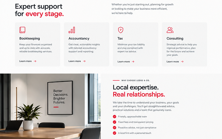
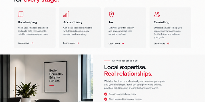
Built on React, headless CMS. A modern, responsive experience designed and developed to meet the objectives above.
Live website available on request.
What the project set out to do.
Original requirements
Service pages, team and sector pages, an enquiry form and resources.
Design objectives
Build trust and generate qualified enquiries.
Brand perception
Professional, approachable and modern.
User requirements
Understand services, see credibility and contact easily.
Business objectives
Generate leads and reflect the firm's expertise.
Colour, contrast and intent.
- Colour theory
- A restrained, professional palette with a measured red accent signals trust and competence.
- Colour ratios
- Roughly 80% neutral surfaces, 15% ink text and 5% accent.
- Why these colours
- Financial services demand credibility; restraint reads as expertise.
- Accent usage
- Red for the enquiry CTA and key figures.
- Contrast
- AA throughout, with clear focus states for forms.
Type that carries the structure.
- Typeface
- A confident sans for headings and a readable body for explanations.
- Hierarchy
- Service → benefit → detail, consistently applied.
- Weights
- Regular body, semibold for emphasis, bold for figures.
- Readability
- Plain-English explanations stay comfortable to read.
- Role in the brand
- Typography communicates clarity and care.
How the experience works.
- User journey
- Land → understand services → see proof → enquire.
- Navigation
- Services, sectors, about and contact — clean and predictable.
- Information architecture
- Services → sector → detail, with clear cross-links.
- Layout
- Calm, content-led pages with clear calls to action.
- Hierarchy
- Services and contact lead; resources support.
- Calls to action
- 'Get in touch' and 'Book a consultation' throughout.
- Responsive design
- Fully responsive forms and content across devices.
- Interaction design
- Subtle, professional motion — never gimmicky.
- Conversion
- A clear enquiry form and multiple contact paths.
What it actually does.
Service pages
Clear, structured pages for each service and sector.
Enquiry form
A simple, validated form routed to the right team.
Team & sector pages
People and sector specialism pages for credibility.
Resources & blog
Guides and articles to build authority and SEO.
CRM & email
Form submissions connected to the firm's CRM and email.
Built to be fast and reliable.
Responsive behaviour
Content and forms tested across breakpoints.
Performance
Static, cacheable pages and minimal JavaScript.
Image optimisation
Imagery served as WebP at display size.
Form & link testing
Forms, links and redirects verified before launch.
Built to be found and understood.
On-page SEO
Clean metadata, headings and descriptive URLs.
Local SEO
Sector and location pages targeting local intent.
AEO
Structured FAQs so AI answer engines can surface the firm's answers.
Heading structure
A clear, semantic heading order on every page.
Usable by everyone.
Colour contrast
All text meets WCAG AA.
Keyboard access
Full keyboard navigation of navigation and forms.
Accessible forms
Labelled, validated forms with clear error messages.
GDPR & privacy
Explicit consent, a privacy policy and cookie controls.
What it achieves.
A modern, trustworthy site that explains the firm clearly and turns visitors into enquiries.