TrueTick
A focused, fast productivity platform that helps teams plan, track and ship work without the noise.

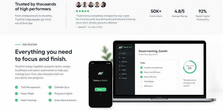
The project at a glance.
A focused, fast productivity platform that helps teams plan, track and ship work without the noise.
Objectives
Replace a cluttered legacy tool with a calm, fast workspace that teams actually want to use.
The problem
The existing product buried core actions under menus, loaded slowly and lost users back to spreadsheets within weeks.
Target audience
Product and operations teams at small-to-mid-sized SaaS companies who live in their tools all day.
What we built.

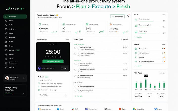
Built on React, Node.js, PostgreSQL. A modern, responsive experience designed and developed to meet the objectives above.
Live website available on request.
What the project set out to do.
Original requirements
A clean, responsive web app with task management, scheduling, reporting and team workspaces.
Design objectives
Reduce time-to-first-action, increase daily active use and make the value obvious within seconds.
Brand perception
Calm, capable and modern — a tool that respects your attention.
User requirements
Fast keyboard-first flows, clear status, low cognitive load and accessibility by default.
Business objectives
Support self-serve signup, usage-based growth and a clear path to paid plans.
Colour, contrast and intent.
- Colour theory
- A near-black base keeps the interface quiet so the green accent can draw the eye to what matters.
- Colour ratios
- Roughly 80% neutral surfaces, 15% ink text and 5% accent — enough to guide, never to overwhelm.
- Why these colours
- Productivity tools live on screen all day; a restrained palette reduces fatigue and keeps focus on the work.
- Accent usage
- Green marks the primary action and current state; the marketing site uses yellow for CTAs.
- Contrast
- Ink on paper and white on ink both exceed AA, with accent reserved for non-text highlights.
Type that carries the structure.
- Typeface
- A geometric sans for UI clarity, paired with a mono for data and timestamps.
- Hierarchy
- Three heading levels, a single body size and a caption — a deliberately small, predictable scale.
- Weights
- Regular for body, semibold for emphasis, bold reserved for numbers and key actions.
- Readability
- Generous line height and spacing keep dense boards readable at a glance.
- Role in the brand
- Typography carries the structure; colour carries the meaning.
How the experience works.
- User journey
- Sign up → invite team → create a board → add tasks → track → report.
- Navigation
- A persistent left rail for workspaces, a contextual top bar for views, and a command palette for power users.
- Information architecture
- Workspaces contain boards; boards contain tasks; tasks contain detail — a shallow, predictable tree.
- Layout
- A dense but breathable board view with a focus mode for single tasks.
- Hierarchy
- Status and due dates lead, descriptions follow, comments sit last.
- Calls to action
- One primary action per screen; secondary actions never compete.
- Responsive design
- The board reflows to columns on tablet and a list on mobile without losing state.
- Interaction design
- Keyboard-first, with drag-and-drop and instant undo.
- Conversion
- A guided first-run and a clear upgrade prompt at the usage limit.
What it actually does.
Task management
Boards, lists, statuses, due dates, priorities and dependencies.
Workspaces & roles
Team workspaces with granular roles and permissions.
Reporting
Live dashboards for throughput, cycle time and workload.
Integrations
Slack, Google Calendar and webhook connections.
Billing
Self-serve plans and usage-based upgrades.
Built to be fast and reliable.
Responsive behaviour
Board, tablet and mobile layouts tested across breakpoints.
Performance
Code-split routes and optimistic UI keep interactions under 100ms.
Image optimisation
Avatars and previews served as WebP at display size.
Testing
Cross-browser, device and form testing before each release.
Built to be found and understood.
On-page SEO
Marketing pages built as static, crawlable routes with clean metadata.
AEO
Structured FAQs and clear answers so AI answer engines can summarise the product.
Search intent
Content mapped to 'how', 'what' and 'best' queries around team productivity.
Usable by everyone.
Colour contrast
All text meets WCAG AA; interactive states are not colour-only.
Keyboard access
Every action reachable by keyboard with visible focus.
Semantic structure
Semantic landmarks, ARIA where needed and live regions for board updates.
What it achieves.
TrueTick gives teams a calm, fast home for their work — one that's quick to adopt and hard to leave.