Threadline
A fast, fashion-forward WooCommerce store for a modern T-shirt brand.

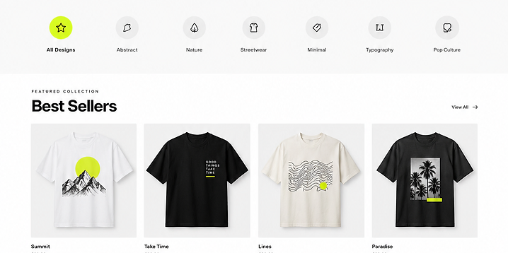
The project at a glance.
A fast, fashion-forward WooCommerce store for a modern T-shirt brand.
Objectives
Move a slow, template-heavy store to a fast, branded WooCommerce build that converts.
The problem
The old theme was bloated, slow on mobile and buried products behind heavy, clunky filters.
Target audience
Style-conscious shoppers who browse and buy on their phones.
What we built.

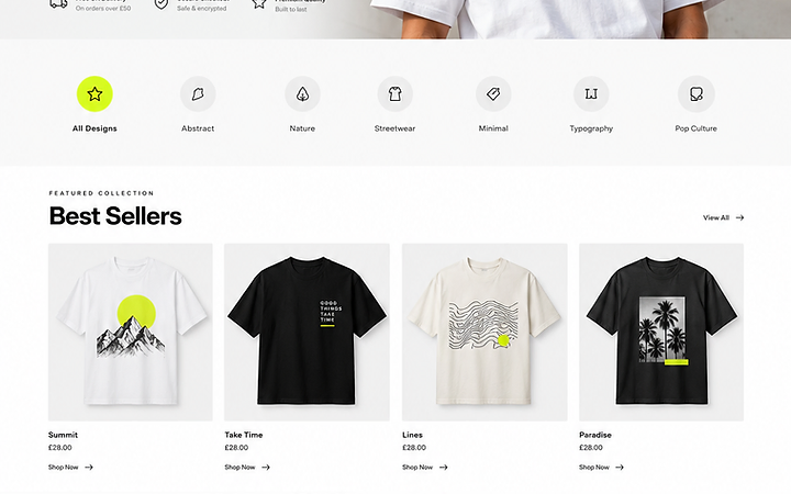
Built on WooCommerce, WordPress, custom theme. A modern, responsive experience designed and developed to meet the objectives above.
Live website available on request.
What the project set out to do.
Original requirements
Catalogue, product pages, cart, checkout, payments and stock management.
Design objectives
Increase conversion and average order value while reducing load time.
Brand perception
Clean, confident and brand-led.
User requirements
Fast browsing, clear sizing and an easy checkout.
Business objectives
Manage stock, run promotions and grow with content.
Colour, contrast and intent.
- Colour theory
- A near-monochrome store with a sharp yellow accent lets product photography lead.
- Colour ratios
- Roughly 80% neutral surfaces, 15% ink text and 5% accent.
- Why these colours
- Fashion retail needs the product to be the hero; the interface stays out of the way.
- Accent usage
- Yellow for sale tags, the cart and the buy button.
- Contrast
- AA on all text; product imagery carries the brand.
Type that carries the structure.
- Typeface
- A geometric sans for navigation and a display weight for product names.
- Hierarchy
- Product → price → description, consistently applied.
- Weights
- Regular body, bold for prices and CTAs.
- Readability
- Sizing guides and descriptions stay comfortable to read.
- Role in the brand
- Typography keeps the store calm so products pop.
How the experience works.
- User journey
- Browse → product → cart → checkout → confirmation.
- Navigation
- Shop by collection, search and a persistent mini-cart.
- Information architecture
- Collection → product → variant, with related items.
- Layout
- Image-led product pages with a sticky buy bar on mobile.
- Hierarchy
- Image and price lead; reviews follow.
- Calls to action
- 'Add to cart' and 'Checkout' are always obvious.
- Responsive design
- Thumb-friendly mobile browsing and checkout.
- Interaction design
- Quick view and an AJAX cart for fast browsing.
- Conversion
- A free-shipping prompt and a relevant upsell at checkout.
What it actually does.
WooCommerce catalogue
Collections, products, variants and featured items.
Product variants
Size and colour options with live stock levels.
Cart & checkout
Streamlined cart and a single-page WooCommerce checkout.
Payments
Stripe and PayPal with Apple Pay and Google Pay.
Stock management
Live stock, backorder settings and low-stock alerts.
Discount codes
Promo codes and scheduled sale pricing.
Built to be fast and reliable.
Responsive behaviour
Catalogue, product and checkout tested across breakpoints.
Performance
Caching, lazy loading and a lean theme cut load time sharply.
Image optimisation
Product images served as WebP at display size.
Testing
Cross-browser, device, checkout and payment testing.
Built to be found and understood.
On-page SEO
Product schema, clean metadata and descriptive URLs.
AEO
Product FAQs and structured data for AI answer engines.
Internal linking
Collections, related products and breadcrumbs throughout.
Usable by everyone.
Colour contrast
All text and buttons meet WCAG AA.
Keyboard access
Full keyboard navigation of shop, cart and checkout.
Alt text
Descriptive alt text on every product image.
Accessible forms
Labelled, validated forms with clear error states.
What it achieves.
A faster, more confident store that turns browsers into buyers and scales with the brand.